Stage 2 — Build
The Pile captured your ideas. Build gives them position, relationship, and structure. When you enter Stage 2 the canvas opens and your pile cards move to the Pile Drawer on the left. You bring them onto the canvas and arrange them intentionally. Connections form paths. The structure of your project becomes visible. All tools are available from day one.
The Canvas
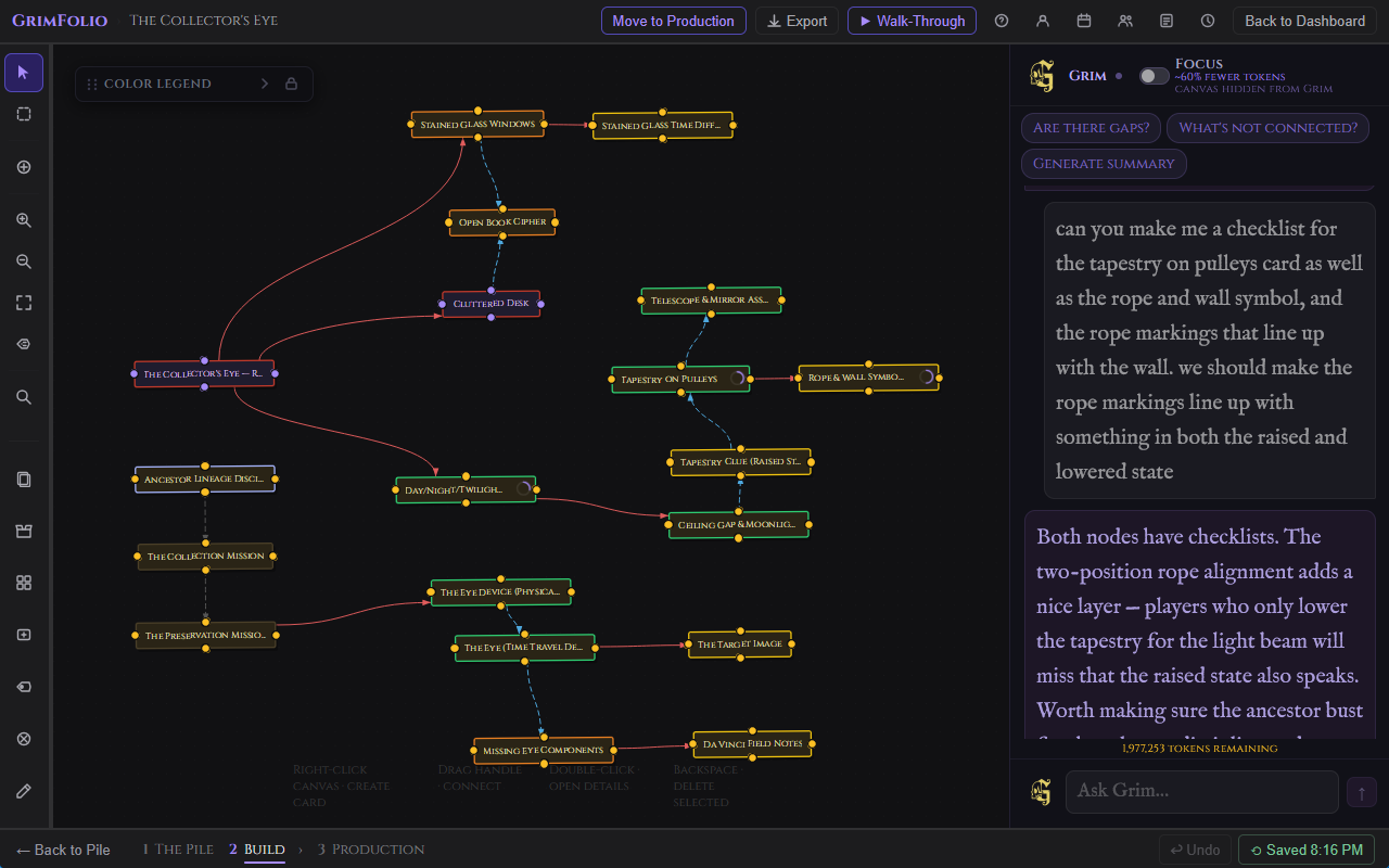
The canvas is an infinite spatial workspace rendered on a dot-grid background. Pan by dragging any empty area. Zoom by scrolling or use the + and - buttons in the left toolbar. Minimum zoom is 10%, maximum is 200%. Fit to Screen reframes the camera to show all placed cards.
Snap to grid (16px) is optional. Toggle it in Account Settings → Appearance.
Card Face Anatomy
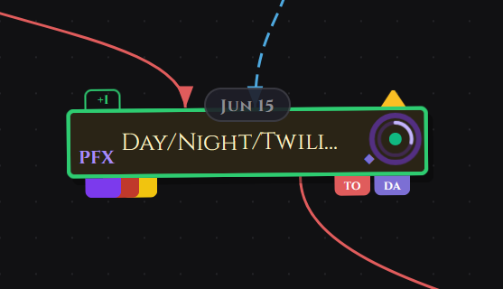
Every canvas card can show a set of indicators at a glance without opening the drawer.
| Indicator | Where | What it means |
|---|---|---|
| Due date pill | Top center | Shows the card's due date when "show on card" is enabled. See Due Dates. |
| Mirror prefix | Left edge | Short label used to identify mirrors of this card. See Mirror Prefix. |
| Priority indicator | Top, left of ring | Triangle icon when the card has a priority set. See Priority. |
| Checklist ring | Top-right | Glowing ring when the card has a checklist. Purple = has items. Gold pulsing = overdue or urgent items. |
| Inspiration diamond (◆) | Just left of the ring | Gold diamond when at least one inspiration image is linked to this card. |
| Assignee flags | Bottom-right | Colored initials chips for each assigned team member. See Card Assignment. |
List View and Board View
The canvas is the default Stage 2 view, but you can switch to a List View or Board View using the toggle icons in the top bar (the grid and list icons beside the Export button).
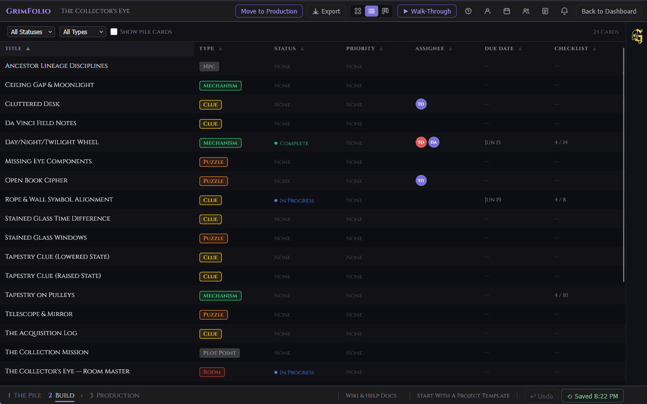
List View displays all canvas cards in a sortable table. Columns: Title, Type, Status, Priority, Assignee, Due Date, Checklist progress. Click any column header to sort. Click any row to open that card's detail drawer. Use Show Pile Cards to include pile cards in the list.
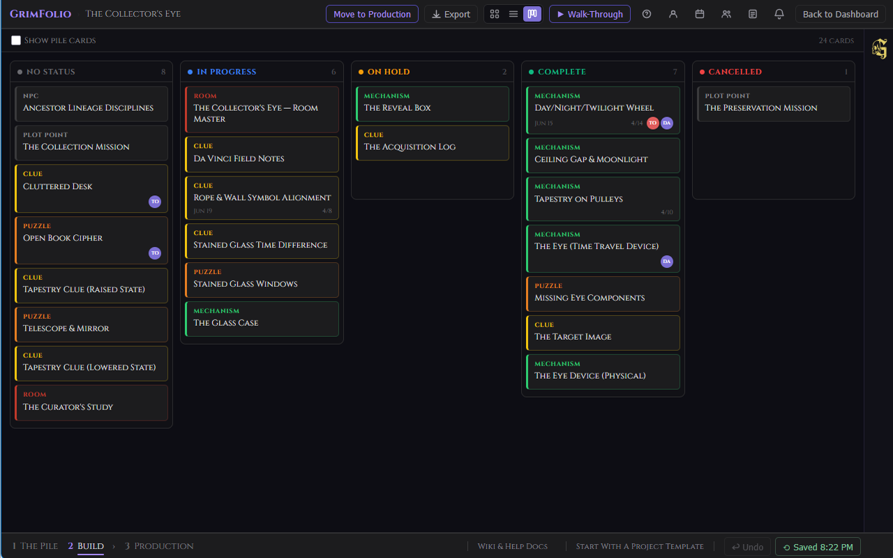
Board View shows cards in Kanban-style columns grouped by status: No Status, In Progress, On Hold, Complete, Cancelled. Drag a card from one column to another to update its status instantly. Click any card to open its detail drawer.
The Left Toolbar
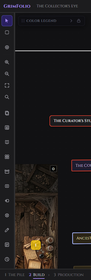
A narrow vertical toolbar on the left edge of the canvas. Tools are grouped into two sections — navigation and selection modes on top, workspace tools on the bottom.
Left Toolbar — Top Section
| Tool | Icon | What it does |
|---|---|---|
| Select | Cursor arrow | Default mode. Click to select cards, drag to move, drag from handles to connect. Tooltip: "Select (Esc)" |
| Multi-Select | Dashed rectangle | Drag across empty canvas space to select cards inside the box. Scroll wheel or two-finger trackpad to pan while in this mode. Ctrl+click adds individual cards to selection. |
| Place Anchor | Circle + crosshair | Click anywhere on the canvas to place a routing waypoint anchor. Tool automatically returns to Select mode after placement. |
| Zoom In | Magnifier + | Zooms in one step. |
| Zoom Out | Magnifier - | Zooms out one step. |
| Fit to Screen | Four-corner arrows | Snaps the camera to show all placed cards. Instant, no animation. |
| Edge Labels | Hexagon with lines | Toggles visibility of edge labels — the short text added to connections via right-click. Does NOT affect path label pills, which are always visible regardless of this toggle. |
| Search | Magnifier | Opens the canvas search bar. Auto-focuses the input on open. Escape closes it and clears the query. |
Left Toolbar — Bottom Section
| Tool | Icon | What it does |
|---|---|---|
| Pile Drawer | Stacked cards | Opens and collapses the Pile Drawer on the left. |
| Inventory | Open box | Opens the Inventory panel scoped to this project. |
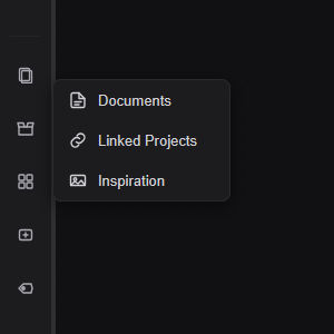
| Libraries | Four squares | Opens a popout with three sub-items: Documents, Linked Projects, Inspiration Library. |
| Create Card | Rectangle + | Click any spot on the canvas to place a new card at that position. |
| Path Label | Hexagon | Click any connection to place a floating label pill on it. |
| Eraser | Circle X | Click any edge or anchor node to delete it. |
| Drawing Tools | Pencil | Opens the Drawing Tools panel. |
| Team Notepad | Notepad | Opens the shared team notepad. Studio plan only — hidden on other plans. |
| Catalogs | Open book | Opens the Vendor Catalogs panel. Browse products from integrated vendor catalogs and add them directly to cards. See Vendor Catalogs below. |
| Project Checklist | Checkbox list | Opens the project-wide checklist panel — a task list for the project as a whole, separate from card-level checklists. See Project-Wide Checklist below. |
Search
The search bar is opened from the Search button in the left toolbar. It auto-focuses the input on open. Escape closes it and clears the query.
| Element | What it does |
|---|---|
| Search input | Filters cards in real time by title, type, or notes. Matching cards highlight in place. Non-matching cards dim. |
| Edge Labels toggle | Shows or hides all edge label text on connections. Useful when the canvas is dense. Path label pills are unaffected. |
The Pile Drawer
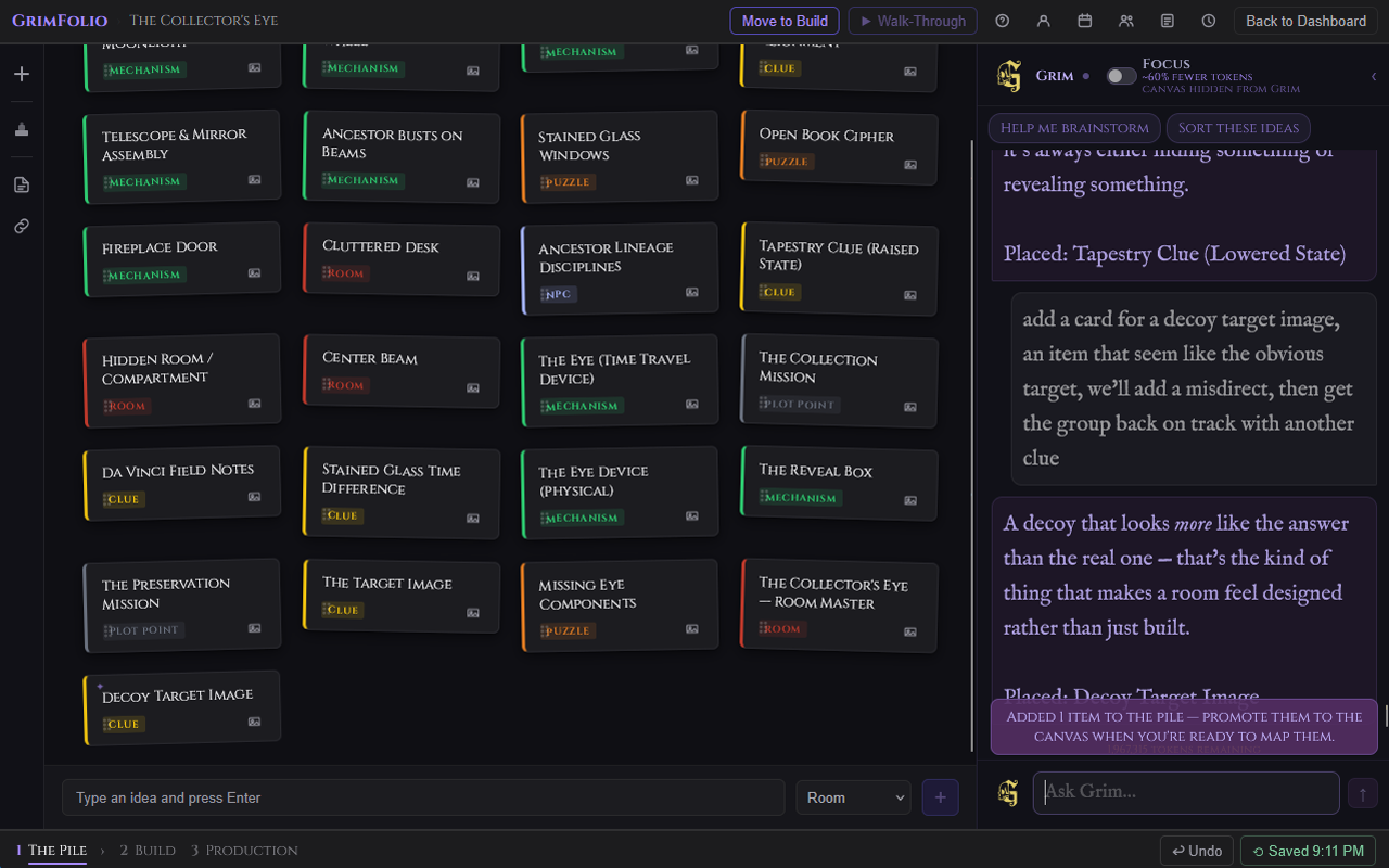
The Pile Drawer opens on the left side of the canvas. It contains every card from Stage 1 that has not yet been placed on the canvas. Cards are grouped by type. Each group has a colored left border. Fully placed groups hide themselves.
The auto toggle controls whether the drawer opens automatically each time you enter Stage 2.
Placing Cards
| Method | What happens |
|---|---|
| Drag onto canvas | Card lands at the drop position. |
| Hover card and click + | Card appears near the center of the visible canvas area. |
Double-click any pile card to read its title and notes in a popup. Right-click for the same option via context menu.
Grim-Created Cards
When Grim creates cards they appear in the Pile Drawer with a 4-second purple glow and a ✦ indicator dot. The drawer header badge pulses when Grim-new cards exist while the drawer is closed. Drag a Grim-created card onto the canvas and open its card detail drawer to see a purple ✦ Added by Grim label at the top.
Template Cards
Cards applied from a Starter Template in Stage 1 appear in the Pile Drawer with a gold ✦ dot. Drag them to the canvas the same as any other card. A brief gold glow confirms the drop. Open the card detail drawer and a gold ✦ Added from template label appears at the top.
Cards on the Canvas
Interactions
| Interaction | Result |
|---|---|
| Single click | Selects the card. |
| Double-click | Opens the card detail drawer. |
| Right-click | Opens the card context menu. |
| Drag | Moves the card. Position saves on release. |
| Drag from handle | Starts a connection. |
Handles
Connection handles are the small dots on all four sides of each card. By default they are always visible. Drag from any handle toward another card to start a connection. A subtle white ring expands when you hover directly over a handle to show it is interactive.
You can switch to hover-only mode in Account → Appearance → Always show card handles. With that toggle off, handles only appear when you hover a card and disappear when you move away. This keeps the canvas visually clean when you are not actively making connections. The drag behavior is unchanged either way.
Card Sizes
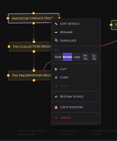
Right-click any card to access the size picker.
| Size | Dimensions | Best for |
|---|---|---|
| Small | 140px wide | Dense canvases where a card is a known landmark. |
| Normal | Default | General use. |
| Large | 320px wide, 130px min height | Hub cards or anything that needs to stand out spatially. |
| Small Square | 140×140px | Compact visual anchors. |
| Large Square | 200×200px | Visual balance or section anchors. |
Locking Position
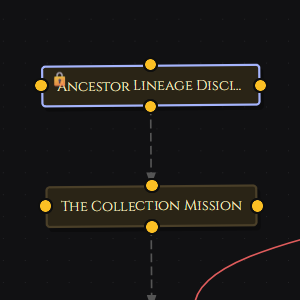
Right-click any card and choose Lock position to prevent accidental dragging. A lock icon appears in the top-left corner of locked cards. Double-click still opens the detail drawer. Right-click again and choose Unlock position to restore movement.
Multi-Select
Click the lasso icon in the left toolbar to enter Multi-Select mode. Drag across empty canvas space to draw a rubber-band selection box. Any cards inside the box when you release are selected together. Ctrl+click adds individual cards to an existing selection.
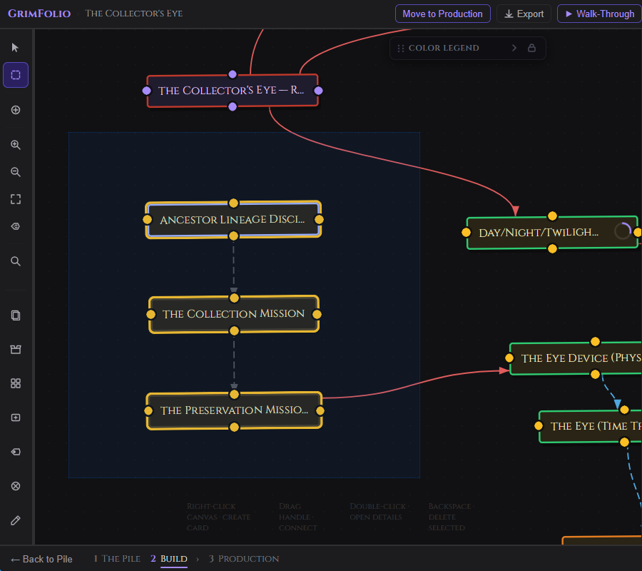
Right-click any selected card to open the multi-card context menu. Available actions apply to all selected cards at once: group, copy, cut, duplicate, return to pile.
To pan the canvas while in Multi-Select mode use the scroll wheel, two-finger trackpad, or middle-mouse drag. Left-drag is reserved for the selection box.
Undo
Press Ctrl+Z (Windows) or Cmd+Z (Mac) from anywhere on the canvas to undo the last action. An Undo button is also available in the bottom bar beside the Restore Points button.
What is undoable: card moves, edge creates, edge deletes, card creates from canvas, card deletes from canvas.
What is not undoable: note edits, budget changes, checklist edits, and anything in the card detail drawer. These persist continuously. For deeper rollback use Restore Points.
Keyboard Shortcuts
| Shortcut | Action |
|---|---|
Cmd/Ctrl + C |
Copy selected card. |
Cmd/Ctrl + X |
Cut selected card (confirmation required). |
Cmd/Ctrl + V |
Paste at cursor position. |
Ctrl+Z / Cmd+Z |
Undo last canvas action. |
Backspace |
Delete selected card (confirmation required). |
Escape |
Exit active tool or close detail drawer. |
Card Detail Drawer
Double-click any card to open its detail drawer. It slides in from the right. The canvas stays visible and interactive behind it.
The drawer has two panels.
Left Panel
| Element | What it does |
|---|---|
| Notes | Free-text field. Auto-saves 800ms after you stop typing. |
| Elements | A tagged list of sub-components, props, effects, or other elements attached to this card. |
Right Panel
| Element | What it does |
|---|---|
| Type picker | The card's category type. |
| Cards and Colors | Opens the Type Manager to add, remove, recolor, or organize types. |
| Title | Editable. Saves on blur or Enter. |
| Status | Click to cycle: blank, In Progress, On Hold, Complete, Cancelled. |
| Priority | Low, Medium, High, or Critical. Appears in the Cross-Project Rollup and Card Summary export. See Priority. |
| Due Date | Date picker. Option to show the date on the canvas card face. See Due Dates. |
| Tags | Color-coded labels applied from your account-wide tag library. See Tags. |
| Assignees | Team members assigned to this card. Colored initials flags appear on the card face. See Card Assignment. |
| Icon | Single character or emoji pinned to the card. |
| Subtitle | Secondary descriptor shown in the card header. |
Cards created by Grim show a purple ✦ Added by Grim label at the top of the drawer. Cards placed from a Starter Template show a gold ✦ Added from template label. Both are informational and do not affect the card.
Sections
All sections are collapsible. A count badge shows when a section has content.
Photos — Upload reference photos directly or pick from your Inspiration Library or GrimVision. Pin any photo to display it on the canvas card. See Pinned Card Photos.
Inspiration — Link images from the project's Inspiration Library. The GrimVision button opens the AI concept art panel.
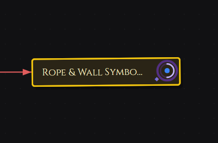
Checklist — Add and check off task items. A glowing ring appears in the top-right corner of the card's canvas tile reflecting progress. A purple static ring means the card has checklist items. A gold pulsing ring means one or more items are overdue or flagged urgent. Items can be set to repeat on a schedule — see Recurring Checklist Items.
Budget — Add line items with name, quantity, unit cost, actual cost, and status. Status cycles per line: Planned, Ordered, Received, In Progress, Installed. Set a budget cap for the card. The Remaining line turns red when over budget.
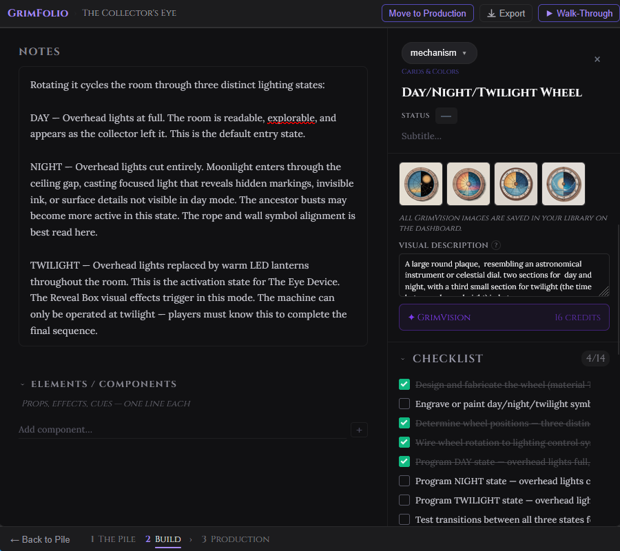
Links — Read-only. Shows all connections to and from this card with direction arrows. Outgoing connections show as →, incoming as ←.
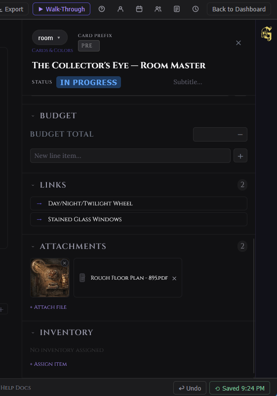
Attachments — Upload files directly to a card. Accepted types: PDF, JPG, PNG, SVG, CSV. Images display as thumbnails and open in a lightbox on click. PDFs open in an inline viewer. CSVs download on click. Upload limits vary by plan. See Card Attachments.
Inventory — Assign physical inventory items from linked collections to this card.
Pinned Card Photos
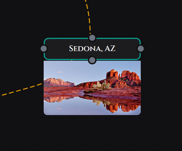
Every card can display one of its photos directly on the canvas, anchored below the card node. This lets you see key reference images at a glance without opening the drawer — useful for scenic renders, floor plan crops, or any image you want visible while routing connections.
How to Pin a Photo
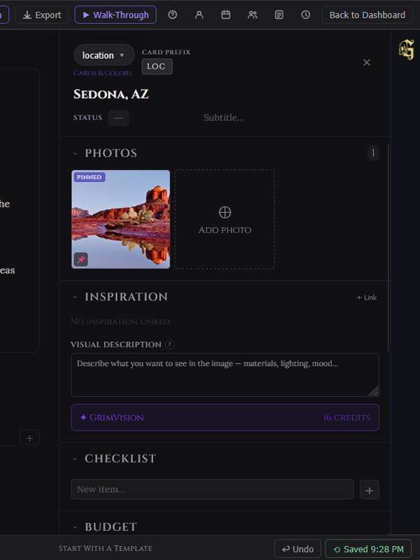
Open the card drawer and expand the Photos section. Each photo thumbnail has two icon buttons:
| Button | Action |
|---|---|
| × (top-left) | Deletes the photo from the card permanently. |
| 📌 (top-right) | Pins or unpins the photo to the canvas card. |
Click the pin icon on any photo. The thumbnail gains a pinned badge and the image appears below the card on the canvas, sized automatically.
Behavior
- Only one photo can be pinned per card at a time. Pinning a second photo automatically unpins the first.
- To unpin without deleting, click the pin icon again on the currently pinned photo. The badge disappears and the canvas image is hidden.
- The pinned photo moves with the card as you reposition it on the canvas.
- Pinning is per-card and independent — different cards can each have their own pinned photo.
- The pin state saves immediately and is visible to collaborators and viewers.
- The pinned photo travels with Full Export and is restored on the imported card.
Quick Notes
Quick Notes is a fast-access notes popover on the card right-click context menu. Right-click any card and select Quick Notes to open a floating textarea anchored near the click position.
The popover opens pre-filled with the card's existing notes. Start typing and changes save automatically 800ms after you stop. Close the popover with the × button, by clicking outside, or by pressing Escape — all three methods save any pending changes immediately. A Saved indicator appears briefly to confirm each write.
Quick Notes writes to the same notes field as the Notes section in the card detail drawer. Changes made in the popover appear immediately in the full drawer, and vice versa. They are a live mirror of the same data.
Card Attachments
The Attachments section in the card detail drawer lets you upload files directly to a card. It sits between the Links and Inventory sections.
Accepted File Types
| Type | What happens when you click it |
|---|---|
| JPG, PNG, SVG | Displays as an 80×80 thumbnail. Click to open full size in a lightbox overlay. Press Escape to close. |
| Opens inline in a modal viewer. Press Escape or click outside to close. | |
| CSV | Downloads to your device immediately on click. |
Upload Limits
| Plan | Attachments per card |
|---|---|
| Free | Not available |
| Base Unlimited | 5 |
| Pro | 10 |
| Studio | 20 |
Maximum file size is 10 MB per file. The upload button does not appear on mobile — attachments can only be added from a desktop browser.
Deleting Attachments
A × button appears on each attachment. Project owners and editors can delete any attachment. Viewers cannot delete.
Mirrors
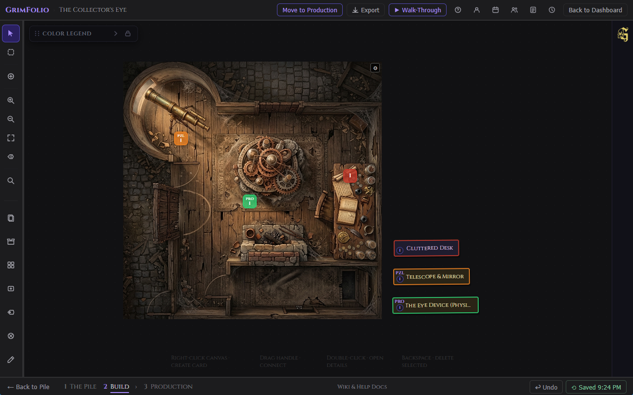
A mirror is a small proxy node on the canvas that represents a parent card. The mirror carries no content of its own — all data lives on the parent card. You can place as many mirrors of a single card as you need.
Mirrors are designed for large, spatially complex builds: floor plan layouts for haunted house zones, escape room puzzle placement diagrams, event booth maps, and any project where a card needs to appear in multiple physical locations at once.
Creating a Mirror
Right-click any card and select Create Mirror. A new mirror node appears near the parent card. Drag it to the intended position on your canvas. Available on single-card selection only.
Mirror Appearance
Mirrors are 32×32px rounded squares. They use the parent card's type color as their background. Each mirror displays a label identifying its index within that card's mirror set.
The label mode determines the format. The toggle lives in project settings and persists per project:
| Label mode | Example labels |
|---|---|
| Numbered (default) | 1, 2, 3 |
| Lettered | A, B, C |
Mirror Prefix
Each card can have a short prefix label up to 3 characters. Set it in two places:
- Right-click a card on the canvas and select Set Mirror Prefix. A small popover opens. Type up to 3 characters and press Enter or click outside to save.
- Open the card detail drawer. The Card Prefix input is in the header row next to the card type picker.
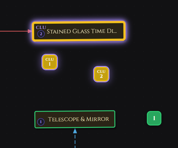
When a prefix is set, mirrors show it on the top line with the index label below. For example with prefix “FX” in numbered mode: the first mirror shows FX above 1, the second shows FX above 2.
Mirror Badge on Parent Cards
When a card has mirrors placed on the canvas, a badge appears in its bottom-left corner on both the canvas tile and the pile drawer card. The badge shows the prefix (if set) above a purple circle with the mirror count. The badge disappears when all mirrors for that card are removed.
Visual Feedback
| Action | What you see |
|---|---|
| Click a mirror | The parent card glows purple on the canvas. |
| Click a parent card | All mirrors of that card glow purple. |
| Hold Ctrl / Cmd and click multiple mirrors | All their respective parent cards glow simultaneously. |
| Select a mirror node | The mirror highlights with the purple glow ring. |
Mirror Right-Click Menu
| Item | Action |
|---|---|
| Go to parent card | Pans the canvas to the parent card and selects it. |
| Set Mirror Prefix | Opens the prefix popover for the parent card. |
| Delete Mirror | Removes this mirror node. The parent card is not affected. |
Connections and Walk-Through
Mirrors support full connections. Drag from any handle on a mirror to another card or mirror to create a path. Mirror-to-mirror connections are supported. Connection data is shared with the parent card — connections drawn from mirrors appear in the parent card's Links section in the detail drawer.
Walk-Through mode follows mirror paths. When the active step is a mirror, the camera centers on the mirror's position on the canvas while the drawer shows the parent card's content including title, type, notes, and checklist. Advance buttons show the next connected card or mirror by its parent card name. Breadcrumbs display parent card names throughout.
Connections and Path Labels
Drag from any card handle to another card to create a connection. The canvas draws a curved path with an arrowhead pointing toward the target. Connection direction matters — Walk-Through follows arrows forward.
Path Labels
A path label is a text pill floating on a connection that describes the relationship: "blocks," "leads to," "depends on." Right-click any connection and choose Edit path label to set one, or use the Path Label tool in the left toolbar and click directly on any connection. The pill appears mid-edge and can be dragged along the path to reposition it.
Path labels appear in Walk-Through navigation buttons.
Anchor Nodes
Anchors are small purple circles used as routing waypoints. They have no title, no detail view, and no content. They bend connections around other cards and create cleaner path geometry.
Place an anchor:
- Right-click the canvas and choose Add anchor.
- Activate the Place Anchor tool in the left toolbar then click anywhere on the canvas.
Each anchor supports exactly one incoming and one outgoing connection. Attempting a third connection is blocked with a warning.
Anchors are invisible to Walk-Through, exports, Grim, and card count limits.
Card Groups
Select two or more cards, right-click any of them, and choose Group N selected cards. A colored boundary box wraps them with an editable label. The boundary auto-sizes as members move.
Dragging the group boundary or label moves all member cards together. Individual cards inside a group can still be dragged independently.
Right-click a group boundary for group options:
| Option | What it does |
|---|---|
| Rename | Renames the group. |
| Hide / Show Boundary | Toggles the visible boundary ring. |
| Fill opacity | 10%, 15%, 25%, or 50%. |
| Reset to auto-size | Recalculates the boundary to fit current member positions. |
| Ungroup | Dissolves the group, keeps all cards in place. |
Add to Group / Remove from Group are available on individual card right-click menus. Add opens a group picker. Remove clears immediately.
Context Menus
Canvas — right-click empty space
| Item | Action |
|---|---|
| Add Export Frame | Places an Export Frame on the canvas at the viewport center. Default size is Letter Landscape (11×8.5"). See Canvas Export Frames. |
| Export Canvas | Opens the export menu. Quick Export captures the full visible canvas as a PNG with no frame needed. Export Frames opens the export modal and requires at least one Export Frame to be placed first. Clear all export frames appears when frames are present and removes all of them at once. |
| New Card | Opens card creation modal at click position. |
| New room tile | Opens card creation pre-set to room tile style. |
| Paste | Pastes clipboard card at cursor position. |
| Add anchor | Places an anchor at click position. |
| Add Canvas Image | Opens picker to place a reference image on the canvas. |
Card — right-click any card
| Item | Action |
|---|---|
| Edit details | Opens the card detail drawer. |
| Rename | Activates inline title editing. |
| Quick Notes | Opens a small floating textarea anchored near the click position. Pre-filled with any existing notes. Auto-saves 800ms after you stop typing. Close with ×, clicking outside, or Escape — all three save immediately if anything is pending. A “Saved” indicator confirms each write. |
| Duplicate | Creates a copy offset from the original. |
| Size | Picker: Small, Normal, Large, Small Square, Large Square. |
| Cut | Copies to clipboard then deletes (with confirmation). |
| Copy | Copies title, status, notes, checklist, and budget to clipboard. |
| Paste | Pastes clipboard card near cursor. |
| Copy to [Project] | Copies card to the pile of a linked project. |
| Return to pile | Removes card from canvas, returns it to the pile drawer. |
| Create Mirror | Places a miniature mirror node near the card. Drag it to its intended position on the canvas. Available on single-card selection only. |
| Set Mirror Prefix | Opens a small popover to assign a short prefix label (up to 3 characters) to this card. Mirrors display the prefix combined with their index label. |
| View Mirrors (N) | Highlights all existing mirrors for this card and pans to show them. Only appears when the card already has mirrors. |
| Lock / Unlock position | Prevents or restores accidental dragging. |
| Delete | Deletes card with confirmation. |
| Group options | Group selected cards, Add to Group, Remove from Group. |
Connection — right-click any connection
| Item | Action |
|---|---|
| Edge label | Short text on the line, up to 25 characters. |
| Line style | Solid, Dashed, Dotted. |
| Color | 8 choices: red, amber, teal, sky, purple, pink, slate, gold. |
| Edit path label | Opens the floating path label editor. |
| Clear path label | Removes the path label pill. |
| Delete | Removes the connection. |
Select multiple connections and a bulk toolbar appears to apply color or style to all at once.
Anchor — right-click anchor node
| Item | Action |
|---|---|
| Delete anchor | Removes the anchor and its connections. |
Restore Points
Restore Points are full project snapshots available to Studio plan members. Access them from the bottom bar beside the Undo button.
The panel shows up to 10 auto snapshots (created automatically on project open and after significant changes) and up to 5 manual snapshots (created by clicking Save snapshot). Each restore point shows a timestamp. Right-click any entry to rename or delete it. Click Restore to roll the canvas back to that state.
Walk-Through Mode
Walk-Through traces the canvas as a guided sequence, following the direction of your connections one card at a time. Use it to rehearse a guest experience, a narrative path, or any sequence that has a direction.
The Walk-Through button lives in the top bar. It is disabled until at least one connection exists.
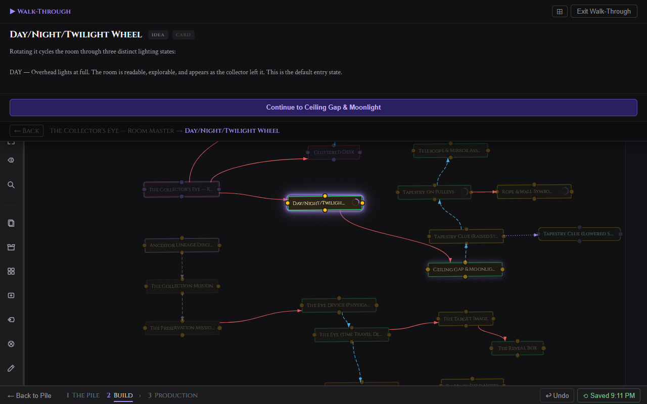
Click Walk-Through to enter pick mode. The canvas dims and all cards pulse. Click the card where the sequence begins.
The Drawer
A full-width drawer slides down from the top and locks in place. The canvas stays live behind it.
| Element | What it does |
|---|---|
| Card title | Name of the current card. |
| Status pill | Current card status. |
| Type badge | Card type. |
| Notes | Card notes if any exist. |
| Action row | Continue button (single path) or fork buttons (multiple outgoing connections). |
| Breadcrumb footer | The full path taken so far. Click any crumb to jump back to that card. |
← Back steps one card back. Hovering a Continue or fork button highlights the corresponding connection and glows the destination card.
Forks
When a card has multiple outgoing connections the action row shows each option as a button. Path labels appear in the button text. Choose one to continue down that branch.
Presentation Mode
Click the expand button in the Walk-Through toolbar to collapse all chrome — the Grim panel closes, the top bar hides, and only the drawer and canvas remain. The canvas stays dark even in light mode.
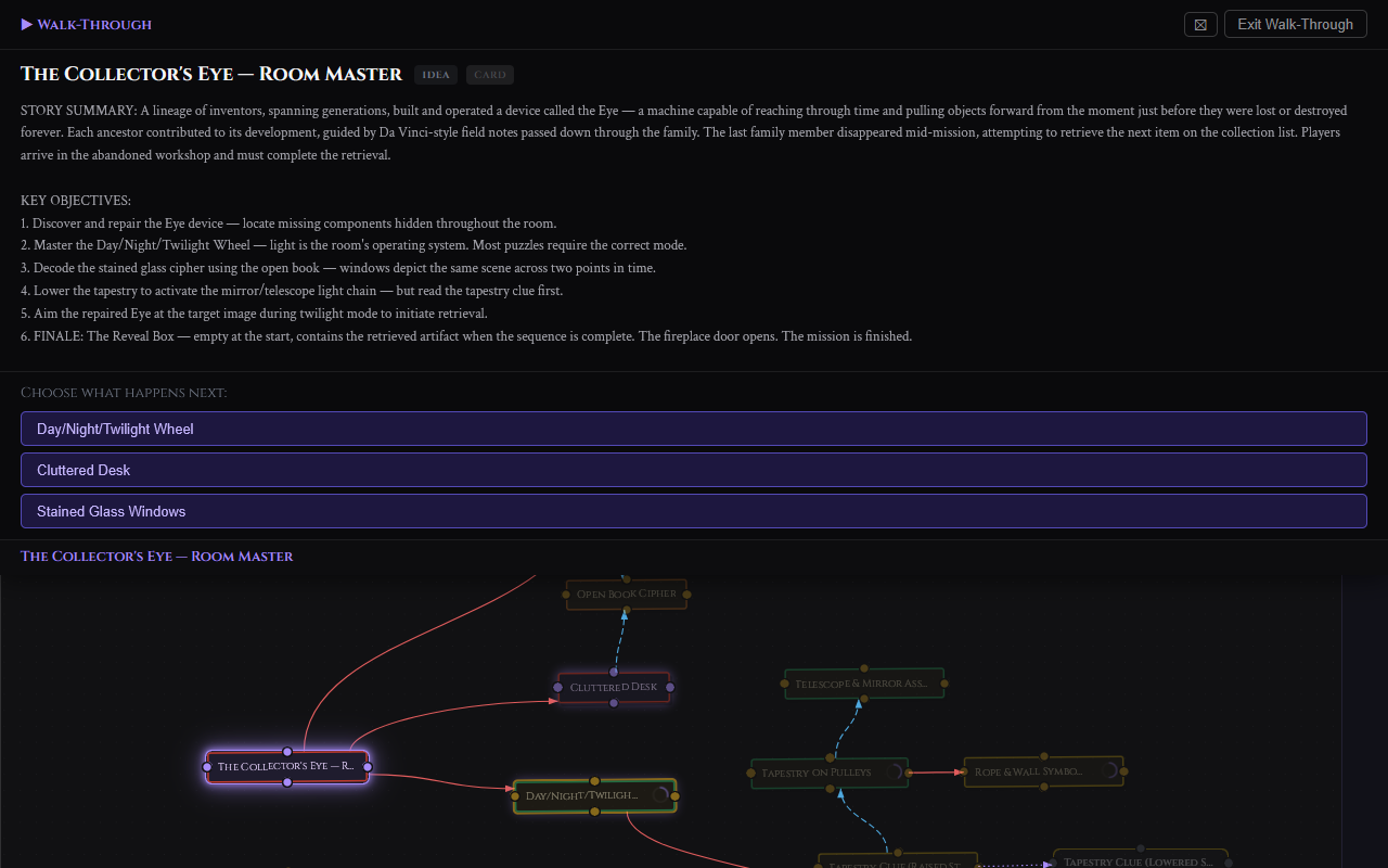
Press Escape while not in presentation mode to exit Walk-Through entirely.
Drawing Tools
The drawing layer sits above the canvas and below card nodes. Use it to sketch floor plans, annotate card positions, measure spaces, or block out zone boundaries. Everything drawn is invisible to Grim, Walk-Through, exports, and card counts.
Click the pencil icon in the left toolbar to open the Drawing Tools panel. Drawing tools work well alongside canvas images — load a floor plan as a canvas image and draw zone boundaries on top of it.
Draw Tools
| Tool | What it does |
|---|---|
| Freehand | Click and drag to draw a freeform stroke. |
| Line | Click and drag to draw a straight line. Hold Shift to constrain to 45-degree angles. |
| Rectangle | Click and drag to draw a rectangle. |
| Circle / Ellipse | Click and drag to draw an ellipse. |
| Text label | Click to place a text element. Type your label then press Enter or click away. Double-click an existing label to edit it. |
Edit Tools
| Tool | What it does |
|---|---|
| Select / Move | Click a shape to select it. Drag to reposition. Shift-click to add to selection. |
| Eraser | Click any drawn shape to delete it. |
Keyboard shortcuts while Drawing Tools panel is open:
| Key | Action |
|---|---|
Escape |
Deselect all or cancel active drawing. |
Delete / Backspace |
Delete selected shapes. |
Ctrl+Z |
Undo last drawing action (local session stack, separate from canvas undo). |
Ctrl+C |
Copy selected shape. |
Ctrl+V |
Paste copied shape offset by 20px. |
Stroke and Style Controls
Stroke — Available for all tools except Text. Pick a color and set stroke width: 1, 2, 4, or 8px.
Text — Color picker for text color and font size buttons: 12, 16, 24, or 36px.
Fill — Available for Rectangle and Circle. Toggle fill on and pick a fill color. Off by default.
Opacity — Slider from 10% to 100%. Applies to all shapes.
Scale
Set a real-world scale — one grid square equals a measurement in ft, m, cm, or in. While drawing a rectangle, circle, or line a live dimension label appears showing the shape's size in your chosen units. Dimension labels also persist on placed shapes.
Snap Options
Grid snap — Constrains shape start and end points to the 16px grid.
Edge snap — Rectangles and circles snap to the edges of other existing rectangles and circles when drawn or moved close to them. The target shape highlights in purple when a snap occurs.
Hide Canvas
The Hide Canvas button in the drawing panel hides all cards, connections, groups, and canvas images. Only your drawings remain visible. The grid stays visible. Click Show Canvas to restore.
Clear All Drawings
Click Clear all drawings at the bottom of the panel. Click again to confirm. This removes all drawings for the current project permanently.
Canvas Images
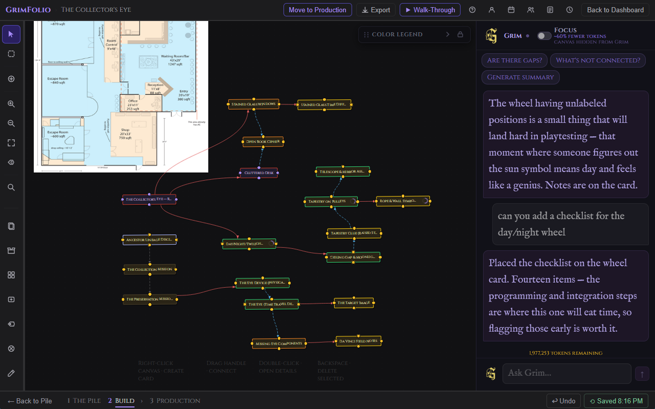
Canvas images are photographs, floor plans, or AI-generated artwork placed directly on the Build canvas. They sit behind all cards and drawing layers. They are not cards and do not appear in the Pile, Walk-Through, Grim context, or exports.
Placing an Image
Right-click any empty area of the canvas and select Add Canvas Image. The image picker opens with three tabs:
| Tab | What it shows |
|---|---|
| Upload | File picker. Accepts JPG, PNG, WebP, GIF up to 20MB. |
| Inspiration Library | All images from your Inspiration Library. |
| GrimVision Library | AI-generated images from GrimVision. |
Image Controls
Click a placed image to select it. A gear button appears in the top-right corner. Click it to open the image settings panel.
| Control | What it does |
|---|---|
| Rotation | Slider and numeric input. Range -180 to 180 degrees. |
| Opacity | Slider and numeric input. Range 0 to 100%. |
| Mirror H | Flips the image horizontally. |
| Mirror V | Flips the image vertically. |
| Bring to Front | Raises the image above other canvas images. |
| Send to Back | Lowers the image below other canvas images. |
| Lock position | Prevents the image from being moved by dragging. |
| Delete image | Removes the image immediately. |
Resize handles appear on edges and corners when an image is selected and unlocked at 0 degrees rotation. Drag any handle to resize. Hold Shift to maintain the original aspect ratio.
Canvas Export Frames
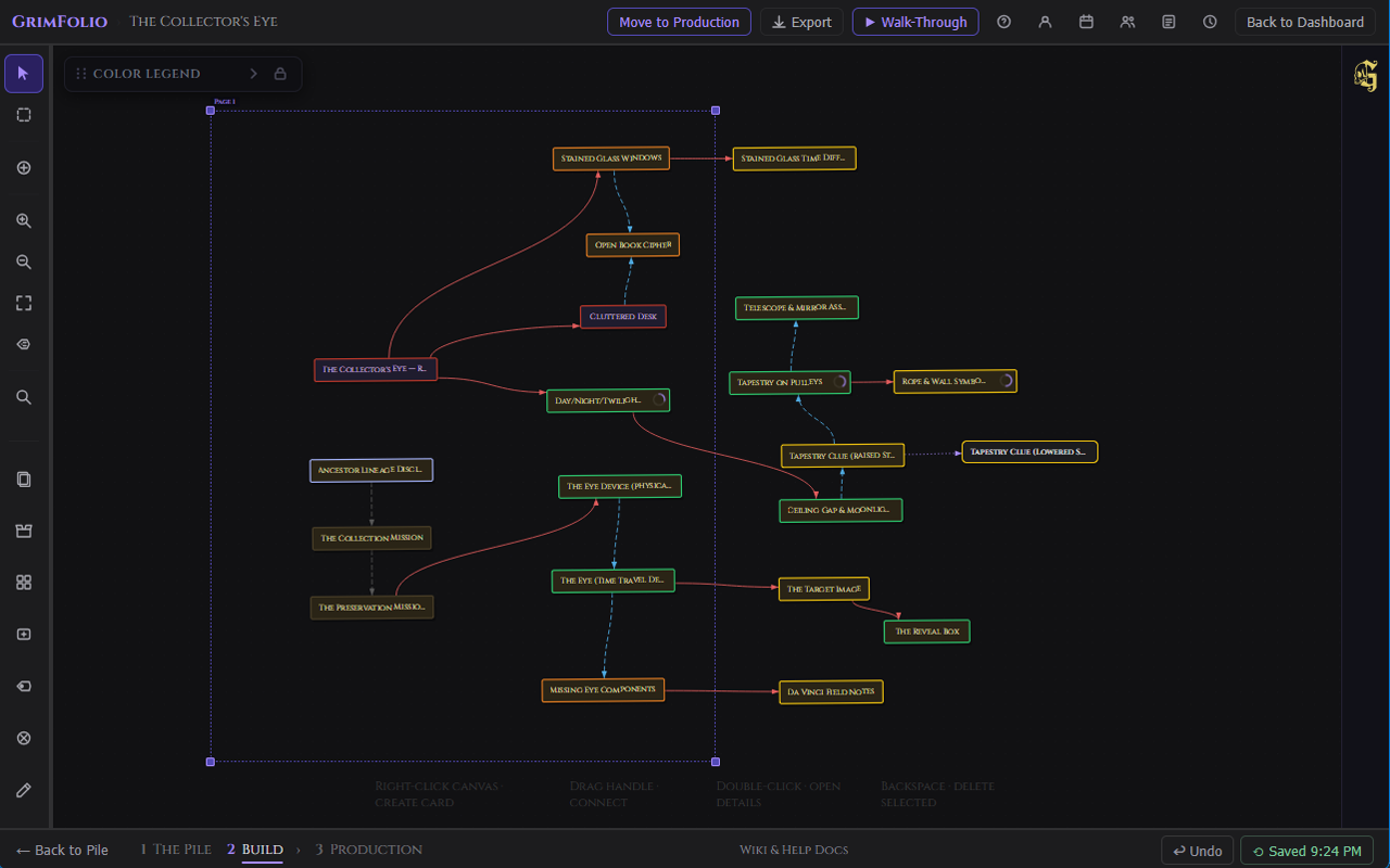
Export Frames are persistent rectangular objects placed directly on the canvas. Each frame defines an export region. Multiple frames produce multiple pages in a PDF or a set of PNG files in a zip archive.
Placing an Export Frame
Right-click any empty area of the canvas and select Add Export Frame. A frame appears at the viewport center in Letter Landscape size (11×8.5”). Drag it to position it, then drag the resize handles to adjust its bounds.
Frame Appearance
Each frame shows a dashed purple border and a page label above the top-left corner (Page 1, Page 2, and so on). The interior is transparent — canvas content is visible through the frame and pointer events pass through normally. The border does not appear in exported output.
Resize handles appear at corners and edges when a frame is selected. Drag any handle to resize. When you resize beyond the original preset's aspect ratio the frame switches to Custom size automatically.
Preset Sizes
| Preset | Orientation |
|---|---|
| Letter (11×8.5”) | Letter landscape |
| Letter (8.5×11”) | Letter portrait |
| Large (17×11”) | Tabloid landscape |
| Large (11×17”) | Tabloid portrait |
| A4 (11.7×8.3”) | A4 landscape |
| A4 (8.3×11.7”) | A4 portrait |
| Square (9.4×9.4”) | Square |
| Custom | Any size set by dragging the resize handles |
Right-click a frame to change its preset, reorder pages, export that frame individually, or delete it. The canvas right-click menu includes Clear all export frames when at least one frame is present.
Page Order
Frames are numbered in the order they were placed. The page label above each frame shows its current page number. Right-click a frame and use the page order controls to swap it with the page before or after. Page numbers update immediately across all frames.
Quick Export vs Frame Export
Right-click the canvas and select Export Canvas to open the export menu.
| Mode | When to use | What it captures |
|---|---|---|
| Quick Export | No frames needed | The full visible canvas at the current screen size. Always exports as PNG. |
| Export Frames | One or more frames placed on the canvas | Opens the export modal. Captures each selected frame as its own page or file. |
Export Modal Options
| Option | Details |
|---|---|
| Format | PNG or PDF. |
| Frames | Shown when more than one frame is placed. Check or uncheck individual frames to include or exclude them. Select all / Deselect all toggle. |
| Resolution | PNG only. Standard (96dpi), High (192dpi), or Print (300dpi). |
| Include mirrors | Toggle mirror nodes on or off in the export. |
| Include drawing layer | Toggle drawings on or off in the export. |
| Include background images | Toggle canvas background images on or off. |
| Include card connections | Toggle connection lines on or off. |
| Transparent background | Exports with a transparent background instead of the dark canvas color. |
Download Behavior
A single frame exported as PNG downloads as one file. Multiple frames as PNG download as a zip archive. PDF always downloads as a single file with one page per frame in page order.
Grim on the Canvas
Grim stays in the right panel throughout Stage 2. He reads both the canvas and the pile at the start of each turn.
When Grim creates cards they go to the Pile Drawer, not onto the canvas. They arrive with a purple glow and a ✦ indicator. Drag them from the drawer to place them where you want them.
| Grim action | What it does |
|---|---|
| Create cards | Adds cards to the Pile Drawer with title, type, and notes. |
| Append to notes | Adds content to an existing card's notes without overwriting. |
| Replace notes | Rewrites a card's notes from scratch. |
| Add elements | Adds items to a card's Elements list. |
| Create checklist | Adds checklist items to a canvas card. |
| Create budget lines | Adds budget line items to a canvas card. |
| Suggest connections | Proposes connections between existing canvas cards. Requires your approval before anything is drawn. |
Grim cannot add checklists or budget lines to Pile cards. If you ask Grim to act on all cards and some are still in the pile, Grim confirms what was done for canvas cards and notes which pile cards were skipped.
Grim does not delete cards, connections, or any project data.
For full Grim documentation see the Grim page.
Vendor Catalogs
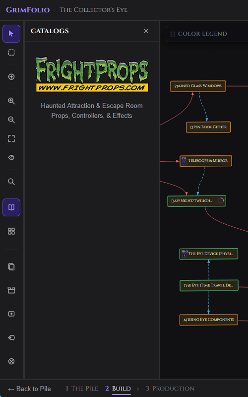
The Catalogs panel gives you a live, searchable product catalog from integrated vendors. Browse props, effects, and controllers, then add items directly to any canvas card's budget and components list — without leaving GrimFolio.
Open it from the open-book icon in the left toolbar. The panel is available in Stage 2 only and only on desktop.
Browsing a Vendor
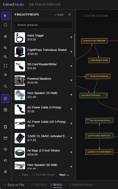
Click a vendor entry to open the product list for that vendor. A search bar at the top filters results in real time by product title or description. Results are paginated — use the Previous and Next buttons at the bottom to page through. The search bar and pagination controls stay fixed while the list scrolls.
Click any product row to open the product detail view. From there, click Add to Card to attach the item to a canvas card.
Adding an Item to a Card
When you click Add to Card on a product, a card picker appears. Type to filter your canvas cards by name, then click the card to confirm. The item is added in two places:
- Components (Elements) — the product title is appended to the card's Components list, visible in the card detail drawer.
- Budget — a budget line is created for the product at the current price, with a ↗ link back to the product page.
Both sections update immediately in the open card drawer without a page reload. Adding the same product to the same card a second time shows a duplicate warning but still allows the add.
Current Vendors
| Vendor | Category | Feed refresh |
|---|---|---|
| FrightProps | Haunted Attraction & Escape Room props, controllers, and effects | Cached every 24 hours from the live product feed |
Tags
Tags are reusable color-coded labels you can apply to any card across all your projects. They are managed globally per account — create a tag once and apply it to cards in any project.
Creating and Applying Tags
Open a card detail drawer and click the Tags field in the header. Your existing tags appear in a picker dropdown. Click any tag to apply it. To create a new tag, type a label, pick a hex color, and confirm. Multiple tags can be applied to one card.
Tags appear as small colored chips on the card in the drawer header. They are also visible in global search results and the Cross-Project Rollup.
Managing Tags
Tag management lives in the tag picker itself. You can rename a tag, change its color, or archive it. Archiving hides the tag from the picker but does not remove it from cards that already have it.
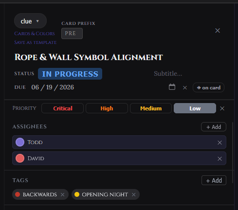
Priority
Each card can have a priority level set in the card detail drawer. Priority is shown in the Cross-Project Rollup Dashboard and the Card Summary export.
| Level | When to use |
|---|---|
| Low | Background work with no urgency. |
| Medium | Standard priority — needs to happen but not blocking anything. |
| High | Elevated attention needed soon. |
| Critical | Blocking, time-sensitive, or must not slip. |
Priority is not shown on the canvas card face itself — it surfaces in list views, rollup, and exports. Leave it blank if a card does not need prioritization.
Due Dates
Set a due date on any card from the Due Date field in the card detail drawer. Click the field to open a date picker and select a date.
Show on card — A toggle next to the date lets you display the due date as a small pill on the canvas card face. This is off by default. Turn it on for cards where the date is important enough to see at a glance without opening the drawer.
Due dates appear in the Cross-Project Rollup Dashboard for planning across projects. To clear a due date, open the date picker and remove the value.
Card Assignment
Cards can be assigned to one or more team members. Assignments are visible on the canvas card face and in the Ownership Report export.
Assigning a Card
Open the card detail drawer and click the Assignees field. A member picker appears listing everyone with access to the project. Click a name to assign them. Choose a color for their flag — this is the color that appears on the canvas card face to identify them at a glance. Multiple team members can be assigned to the same card.
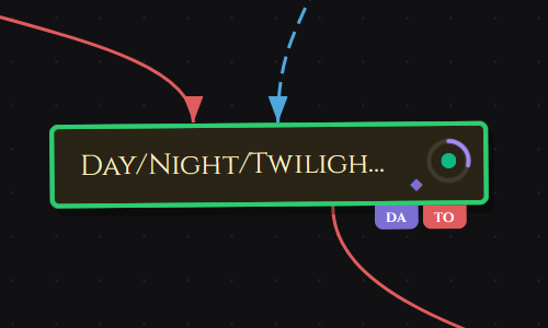
Assignee Flags on the Canvas
Each assigned team member's initials appear as a small colored flag hanging from the bottom-right corner of the card tile. Multiple assignees stack as overlapping flags. This gives an at-a-glance view of ownership without opening any drawer.
Removing an Assignee
Open the card detail drawer, find the assignee chip in the Assignees field, and click the × to remove them. The flag disappears from the canvas card immediately.
Comments & @Mentions
Every card has a threaded comment section at the bottom of the card detail drawer. Use it for questions, decisions, status notes, and anything that belongs with the card rather than in the notes field.
Posting a Comment
Open the card detail drawer and scroll to the Comments section. Type in the input field and press Enter or click Post. Comments can be up to 2,000 characters. Editors and project owners can post. Viewers can read comments but cannot post.
Each comment shows the poster's display name and the time it was posted.
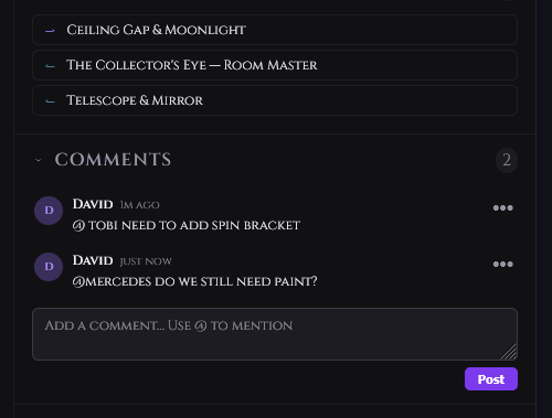
@Mentions
Type @ inside a comment to mention another project member. A picker appears listing all members with access to the project. Select a name to insert the mention. The mentioned person receives a notification. See Notifications.
Unread Comments
Comments posted since you last viewed the card's comment section are marked as unread. The unread state clears automatically when you open the Comments section on that card.
Recurring Checklist Items
Any checklist item — on a card or in the project-wide checklist — can be set to repeat automatically on a schedule. When the reset date arrives the item is unchecked so it reappears as an active task.
Setting Recurrence
In the checklist, click the recurrence button (↻) on any item. A small popover opens with frequency options.
| Frequency | When the item resets |
|---|---|
| Daily | Every day. |
| Weekly | Every 7 days. |
| Monthly | Every 30 days. |
| Custom | Every N days — you enter the number. |
A recurring item shows the recurrence icon beside its label so you can see at a glance which items repeat. To remove recurrence click the icon again and clear the setting.
Project-Wide Checklist
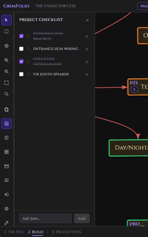
In addition to per-card checklists, every project has a single project-wide checklist — a flat task list that belongs to the project rather than any specific card. Use it for high-level milestones, pre-show tasks, or anything that spans multiple cards.
Opening It
Click the Project Checklist button (checkbox list icon) in the left toolbar. The panel opens in the sidebar alongside the Pile Drawer. It can stay open while you work on the canvas.
What It Does
The project checklist works the same as card-level checklists: add items by typing and pressing Enter, check them off, delete them, and reorder by drag. Recurring items are supported with the same frequency options. Viewers can see the checklist but cannot edit it.
The same checklist appears in the Master Checklist widget in Stage 3 Production. Checking an item in Stage 2 updates it in Stage 3 instantly and vice versa — it is the same data.
Card Templates
Save any card as a reusable template to quickly create new cards with a pre-built checklist, notes, and component structure. Templates are stored per account and can be applied to cards in any project.
Saving a Card as a Template
Open any card detail drawer → options menu (…) → Save as Template. A dialog asks for a template name and what to include:
| Option | What gets copied |
|---|---|
| Include checklist | Checklist items are copied with all items reset to unchecked — no completed state carries over. |
| Include notes | The card's notes field is copied verbatim. |
| Include elements | The card's Elements / Components list is copied. |
Applying a Template
Open any card detail drawer → options menu (…) → Apply Template. A picker shows your saved templates. Select one and the card receives the template's checklist, notes, and elements. Existing card content is merged, not overwritten — if the card already has checklist items the template items are added below them.